Well, that's all on the student magazine. Stay tuned for a music magazine in the near future.
Tata for now :)
Which is your favourite name for a music magazine about new bands?
Friday, 10 December 2010
Evaluation! O:
In what ways does your media product use, develop or challenge forms and conventions of real media products?
My front cover has cover lines, a banner, and a strap line, all important components of a magazine. They are made with a certain colour scheme and font to look classy yet young and vibrant. The contents page is bright and the titles of the sections catch the eye of the reader. The content of the magazine is very student-y, as it contains information about higher education, has celebrity news and gossip, and has various other features that I identified as common when analysing other student magazines. I wouldn’t say that I’ve particularly pushed any boundaries with this design; perhaps I could have done this. However I am happy with this design.
How does your media product represent particular social groups?
With this magazine, I have tried to represents teenagers, in particular students, as this is a student magazine. I have represented them by asking students what they would like in a student magazine, and by using a fun and youthful layout. I have used photos that contain students for the most part, and they look happy and like they are enjoying college. This brings a fun feel to the magazine. I have also used a photo of a gig, which is something that appears in the magazine content, and is also something that links to students because they are commonly associated with live music. I have tried to keep the text and pictures about equal, so it seems like there is lots of content, but doesn’t look boring at too wordy. I have also kept the cover lines and contents page short and snappy so the things that are important to the reader stand out and are easily found. For example, the cover lines are Gig reviews, Latest films, Tuition fees?! and universities. These are all short and snappy.
What kind of media institution might distribute your media product and why?
Using a media institution may lead to a magazine like this being too expensive and not selling. I would want the college to distribute my magazine to the students; however, this may lead to it being unprofessional. To solve this, I would use the techniques that media institutions use to ensure that my magazine looks as professional as possible. Although we already have a college magazine, I think that if I could get mine to look more professional, it would be more popular than the other magazine.
Who would be the audience for your media product?
The audience for my magazine would be students between the ages of 16-18 roughly, of any gender that are generally interested in the things that the magazine contains. They would also be interested in higher education if possible, as this takes up quite a bit of content in my magazine. All in all, I want my magazine to be for normal students who just like to read magazines.
How did you attract/address your audience?
I attracted my audience by using bright colours that appeal to young people and using headlines/cover lines that affect normal students. Many students will be affected by the university fees rising and the cut of EMA, so this would attract people to read about it. The front cover is in black and white apart from the magazine content, which means that they stand out and grab the reader’s attention, which is important to get impulse buyers. My magazine doesn’t have a patronising air by trying to seem ‘cool’, but is also not too formal so that it seems alienated.
What have you learnt about technologies from the process of constructing this product?
I wouldn’t really say that I’ve learnt anything in particular, because I happened to use this blog service before this project, and I used the editing software that I have used for my AS photography. However, I have learnt to manage my time better, and to stick to plans. This will be really helpful for the next part of the project.
Wednesday, 8 December 2010
Monday, 6 December 2010
New and improved - Front Cover!
Contents page
Friday, 3 December 2010
Front cover design
Thursday, 2 December 2010
Basic Layouts
These are my basic designs for front covers.
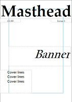
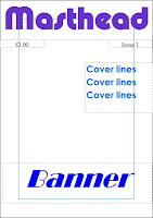
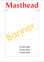
Out of the three basic designs, although I like all of them, number two seems to have quite a young feel about it. However, I will use different colours, more along the lines of number three, as I prefer these colours because they stand out and grab your attention. I will move elements of the design around to fit the picture, however the basic setup will be like that.


Out of the three basic designs, although I like all of them, number two seems to have quite a young feel about it. However, I will use different colours, more along the lines of number three, as I prefer these colours because they stand out and grab your attention. I will move elements of the design around to fit the picture, however the basic setup will be like that.

Monday, 29 November 2010
Friday, 26 November 2010
Photoshoot
I have now completed my photoshoot. All didn't exactly go to plan, as the camera was rather tempermental, but we got a few good shots.
I definately plan on using the following three pictures:
I definately plan on using the following three pictures:
However I will edit them to make them look more edgy and interesting. This means that the magazine will be more eye catching and exciting.
I also took photos that I do not want to use in my magazine:
I am not using these pictures either because they are blurry or I just don't think that they will fit in with the theme of the magazine.
I will now take more photos and edit them so that they are suitable for use in the magazine.
Monday, 22 November 2010
Questionaire
1. What type of music do you listen to most?
2. What is your favourite genre of film?
3. What are your concerns about education?
4. What would you like to see as a competition prize?
5. Would you like to see information about gap years?
6. Do current affairs interest you?
7. What information would you like to see about higher education?
8. How many times should a magazine such as this be released?
9. How much would you expect to pay for a student magazine?
10. What would you like to see on the front of a student magazine?
Please leave your answers in the comments box below (:
Organising a photoshoot
I have to organise a photoshoot so that I can create images that are suitable for my magazine to use both on the front cover and on the contents page. These must be relevent to college, but not over college-y, as that would make the magazine boring and unattractive.
I shall take the photos when I am at college, so they can be natural and fitting. I want them to be outside, and I want the students to look happy and like they are enjoying college. This will create a positive vibe, and it is possible that more people would buy it because of this.
I will take the photos this week, so that I keep up with my action plan. This means that I can start creating my front page towards the end of this week.
Textual analysis
I will analyse the front cover of etc magazine so that I can get a good idea of what I can do with my front cover and contents page to make it appealing.
The mast head is large, and in your face, so it is the first th ing that you see. It stands out by using a bright primary colour against the black of the background. This is a common theme of magazines. We are told what etc stands for in the strapline; Education/Training/Careers. This shows that it is relevent to students, and has an appropriate but non patronising title. The title is in a font that uses serif, which makes the title look sophisticated and grown up, meaning that students would be happy to read this.
The mast head is large, and in your face, so it is the first th
 ing that you see. It stands out by using a bright primary colour against the black of the background. This is a common theme of magazines. We are told what etc stands for in the strapline; Education/Training/Careers. This shows that it is relevent to students, and has an appropriate but non patronising title. The title is in a font that uses serif, which makes the title look sophisticated and grown up, meaning that students would be happy to read this.
 The graphics on the front of the magazine are also brightly coloured, drawing the eye to it, so that we find out what the main story is. The banner is in fact not in normal banner style, it is in a brigh green box, meaning that it stands out even more. This helps to tie in the image with the main headline. We also get cover lines in blue boxes so that they stand out as well.
The final details of the front cover are a website at the bottom so you can access it by other means, and the date of the issue. These are elements that most independent magazines will have.
The contents page has a clear and simple layout. Images relating to the various stories are located on the left hand side, and the stories and the page numbers are on the right of them. The heading of the page, 'contents', is a diffferent colour from the rest of the writing, and is a different font with serif, meaning that it stands out from the rest of the page. The contents are divided up by subheadings, so that we can clearly see the different sections of the magazine, and easily find what we're looking for. The font is sans-serif, meaning it looks simple, clean and easy to read. The names of the pages have very tiny lures underneath, as they tell you about what is on the page.
Overall, this magazine uses bright colours and big fonts to be attractive and grab attention of students, so that they get good reader numbers. I shall incorporate the idea of bright colours, clean, smiple fonts and images on the contents page when designing my front cover and contetns page.
Friday, 19 November 2010
Monday, 15 November 2010
Comparing Student Magazines
Different student magazines offer different things to students. We looked at a range and compared the main features of each magazine:
Student ID:
-Horoscopes
-Hot topics (Vampires)
-Lovin' and Hatin'
-Revision tips
-Reviews
-Photos
-Next issue contents
HC:
-Fun stuff (film and music reviews)
-Good stuff (Gap year, volunteering)
-Student stuff (University, exams)
-Life stuff (Careers)
-Win! Win! Win! (competitions)
-University/college
Smart talent:
-Politics
-Police
-Education
-Volunteering
-Our generation (myspace)
-News
-Life being a teenager (crime)
From this research, we can gather that music and film are clear common themes, as these are two things that pretty much all teens would be interesting. Also, education is common. This is not surprising as it is a student magazine, and so therefore things to do with gap years, universities and exams would be important for them. It is also important to keep up with news or latest trends, so that the magazine can cater to the students' needs. Other than this, the 'fun' elements could be down to the individual writer, as these change with each magazine.
Action Plan
My action plan for the weeks ahead is as follows:
Week One (Starting 15th November):
-Creating this action plan
-Setting up the blog
-Compare magazines
-Decide on the name of my magazine
Week Two (Starting 22nd November):
-Textual analysis of magazines
-Organise and possibly do photoshoot
-Question poll
-Front Cover
Week Three (Starting 29th November):
-Front Cover tweaks
-Contents
-Get audience feedback
Week Four (Starting 6th December)
-Evaluation
Subscribe to:
Comments (Atom)


