Which is your favourite name for a music magazine about new bands?
Friday, 11 March 2011
Audience feedback
Yeah, the videos wont upload, so you lovely people can't see them, but the equally lovely Caroline and examiners can via a CD ^_^
Monday, 28 February 2011
Monday, 14 February 2011
Okay...Final front cover :)
Friday, 11 February 2011
Monday, 7 February 2011
Contents draft
Front cover draft (:
Photoshoot
Friday, 28 January 2011
Interview :)
I decided to interview a real person that is in a new band for my double page spread. I think that it will be more authentic, and it also gives me the prime opportunity to promote them too. It's a win - win situation, really. So, I asked him a few questions about his life, and the band. Have a look see :)
2. How did you decide on 'Ending Of The Crisis'?
Well, basically the band wrote down several ideas of what they think would be a good name for the band. We started scrapping the ones we ddnt like to begin with and finally we were left with two band names. They were called "Ending of the Crisis" and "Effect under Tragic". Personally i liked effect under tragic but the rest of the band liked Ending of the Crisis, so we chose "Ending of the Crisis" as our band name and called our very 1st song "Effect under Tragic" Our singer Ryan came up with the Ending of the crisis idea. As you can see the words Crisis and Tragic both relate to disaster. The band are against war so we're hoping to inspire people to help put an end to the "Crisis" (War)
3. What genre would you describe yourself as?
The band itself hasnt put a set genre on our selves, we like to mix and match, but if we would have to set ourselves within a genre it would be Alternative Rock.
The band don't like pinning all the credit on one person so we usually say the band writes the songs, but I write the music for both guitars and layout of the song while Ryan write lyrics and Bass and drums fill in their own likes
Unfortunately, no. However, we have an upcoming EP launch to promote the EP then we will be gigging throughout local areas and belfast to help promote the EP further.
Well, I love Imogen Heap, she is probably one of my favourite artists, however i've been listening to alot of funeral for a friend who i used to hate alot
I have serveral hobbies outside of the band. In summer, when there's good weather i would go out and skate with the drummer, Declan Toman. We would skate pretty much all day around our area. At home, my hobbies would be working on 3D modelling and animation, I currently study that at collage and have a lot of general interest and enthusiasm in it. Other than these i would ususally play games alot ranging from consoles such as PS3 and Xbox360, once i start im hooked for a large amount of time [laughs]. I would also consider guitar as a hobby as i really enjoy writing new material and making it come to life.
Food and water. [laughs]. Well, entertainment in general, I mean, what would anyone do without some form of entertainment? In my case it would be guitar and games. I would also say i couldnt live without my girlfriend, but isnt that abit cliché? However, i would indeed find it hard to cope without her.
Hmm, in 10 years i want to be at least touring the UK. I would have liked to have played with our biggest influence, Fightstar and have gotten signed by a major record label. I would also like to study more on 3D modelling and animation and hopefully go on to uni.
1. How did the band start then?
Well, Myself and the bass player have been in the same band for over 4 years now, the only things that have changed are the genre and the members. Ending of the Crisis started around this time last year2. How did you decide on 'Ending Of The Crisis'?
Well, basically the band wrote down several ideas of what they think would be a good name for the band. We started scrapping the ones we ddnt like to begin with and finally we were left with two band names. They were called "Ending of the Crisis" and "Effect under Tragic". Personally i liked effect under tragic but the rest of the band liked Ending of the Crisis, so we chose "Ending of the Crisis" as our band name and called our very 1st song "Effect under Tragic" Our singer Ryan came up with the Ending of the crisis idea. As you can see the words Crisis and Tragic both relate to disaster. The band are against war so we're hoping to inspire people to help put an end to the "Crisis" (War)
3. What genre would you describe yourself as?
The band itself hasnt put a set genre on our selves, we like to mix and match, but if we would have to set ourselves within a genre it would be Alternative Rock.
4. Who are you influenced by?
Our influences are Fightstar, deaf havana and alexisonfire5. Who writes the songs, or do you do it together?
The band don't like pinning all the credit on one person so we usually say the band writes the songs, but I write the music for both guitars and layout of the song while Ryan write lyrics and Bass and drums fill in their own likes
6. Any tours coming up?
Unfortunately, no. However, we have an upcoming EP launch to promote the EP then we will be gigging throughout local areas and belfast to help promote the EP further.
7. When did you start playing guitar? How did you learn?
I started learning to play when i was around 12 i think, but i ddnt have the motivation or knowledge to keep at it so i stoped for a few years. Then i finally decided to pick it up again and learn. at this time my uncle had already been getting guitar lessons so i asked him to learn me a few songs. My very first song was Vultures by The Offspring and that started to get my motivation higher. After, I then learnt how to read guitar tabs and i began, slowly but surely learning songs on my own. This was huge practise for me and from learning and practising other bands songs, i got were i am today.8. What is your guilty pleasure in music?
Well, I love Imogen Heap, she is probably one of my favourite artists, however i've been listening to alot of funeral for a friend who i used to hate alot
9. What are your hobbies outside of the band?
I have serveral hobbies outside of the band. In summer, when there's good weather i would go out and skate with the drummer, Declan Toman. We would skate pretty much all day around our area. At home, my hobbies would be working on 3D modelling and animation, I currently study that at collage and have a lot of general interest and enthusiasm in it. Other than these i would ususally play games alot ranging from consoles such as PS3 and Xbox360, once i start im hooked for a large amount of time [laughs]. I would also consider guitar as a hobby as i really enjoy writing new material and making it come to life.
10. What is one thing you couldn't live without?
Food and water. [laughs]. Well, entertainment in general, I mean, what would anyone do without some form of entertainment? In my case it would be guitar and games. I would also say i couldnt live without my girlfriend, but isnt that abit cliché? However, i would indeed find it hard to cope without her.
11. Where do you want to be in 10 years?
Hmm, in 10 years i want to be at least touring the UK. I would have liked to have played with our biggest influence, Fightstar and have gotten signed by a major record label. I would also like to study more on 3D modelling and animation and hopefully go on to uni.
12. And finally: What song would you reccommend for all of the readers?
I would recommend my bands song "Colour My World" as there is a kind message to everyone out there, which is "Wear your loved ones on your shoulders, and you will live together forever"
How insightful. :)
I would recommend my bands song "Colour My World" as there is a kind message to everyone out there, which is "Wear your loved ones on your shoulders, and you will live together forever"
How insightful. :)
Monday, 24 January 2011
Front Cover drafts
So here are a few drafts of my front cover....what do you think?
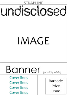

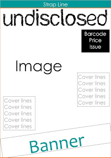
Depending on the photo, some things might get moved about a bit, but I think that I'll use the second design, because it's pretty simple and sophisticated, and so hopefully will attract my target demographic. :D
But which one do you like? Tell me in the comments :)


Depending on the photo, some things might get moved about a bit, but I think that I'll use the second design, because it's pretty simple and sophisticated, and so hopefully will attract my target demographic. :D
But which one do you like? Tell me in the comments :)
Friday, 21 January 2011
And the results are in...again :D
So, drum roll please....
The title font I am going to use is number one, or for those of you who live in a cave:
TADA! :)
Treatment sheet :)
The magazine: Undisclosed
Target reader: Undisclosed is a music magazine aimed at readers who are round about 18-21, or around university age. They could be of either gender, as the magazine is just clean and modern, rather than being focused towards a certain sex. These people would be classed as the ‘alternative’ stereotype. They will be very interested in music; they go to gigs in their spare time and they could possibly be in a band. The readers will have grown up in an era where music magazines have been common elements of life, and music was an important part of the culture of the UK. They will have a wide taste in music, and finding out about new bands would be greatly interesting to the reader of Undisclosed.
Form and style: Undisclosed is a full colour A4 which is focused on bringing new bands to the readers’ attention. Covers would have images of bands, often with their instruments, in a setting which suits their music style, and the colour scheme will be clean and classy. Cover lines will grab the attention of the passing eye, helping to boost sales. The text and graphics will be balanced, at a ratio of about 50:50, or perhaps slightly more text. It will cost roughly £2.50, which is relatively cheap for a magazine, meaning that providing there was good quality content, the magazine should sell well.
Themes and typical features: The main focus of Undisclosed will obviously be on music, but in particular on new ‘alternative’ bands. There will be features on a new band, about the artist, Magazines choice of the new releases by older bands, competitions, gig reviews, upcoming gigs, important things happening in music (or ‘music news’), along with other small features, and the occasional advert. The language of the magazine will not be patronising, as the reader will be grown up, but will also not be too over-‘posh’.
Potential advertisers: The adverts featured should relate to things that the target audience will be interested in, such as hair care, fashion that suits the demographic, such as vans, music shops, and music venues. I think that these adverts would suit my target audience.
Editorial team: Undisclosed is quite a varied magazine, so the editorial team will be made up of a range of people, mostly of the age group, and the stereotype of the target audience, so that they have a better idea of what would interest the target audience. The audience can write in however, and suggest bands or features they would like to see in the magazine.
Monday, 17 January 2011
Music Magazine publishers
Magazines are published by a range of different people:
Bauer Media Group - Q
- Kerrang!
- Mojo
Bauer Media Group have a massive line of magazines in their publication, including the ones above, FHM and GRAZIA. These are huge magazines that sell to a wide demographic. Many of their magazines have radio, television, online and mobile services, meaning they can reach the widest target audience possible.
IPC Media (Time Inc) - NME
- Uncut
IPC also publishes many magazines, but not on the scale that Bauer does. They include Look, Pick Me Up and TV times. These are also very popular magazines, possibly because things like Pick Me Up and TV times are relatively cheap magazines. These also have online services.
MAMA Group (HMV) - The Fly
The MAMA group is owned by HMV. The only publish one magazine, but they focus more on running live music gigs. This means that The Fly is probably more music focused as it is a purely music based company that publishes it. Although this is the UK's best selling music magazine, with online services and videos, this company only reaches one demographic, and so must make that sell.
Future Publishing - Classic Rock
- Metal Hammer
Future publishing publishes magazines to do with lifestyle, such as Games, Technology, Music, Movies and Active. Their biggest titles are XBox360, Total Film and Maximum PC. From these titles, we can guess that in general, their company aims their magazines towards the male demographic. This means that there is a smaller target audience and so they can choose better content.
Font analysis :D
So the results are in - Undisclosed wins!
I want the title font for this magazine to be quite rough, and maybe eroded/distorted.
But what font should I use? I've made a shortlist, which is:

I like number one, but which one do you like? Leave a comment below :)
Moving on, I also need to decide on the font for the rest of the writing. I want to use a sans-serif font to keep the writing clean and modern. My choices are below:
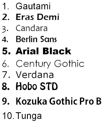
I will use a mixture of these to make up my font group. Which do you like? You know the drill - TO THE COMMENTS! :D
I want the title font for this magazine to be quite rough, and maybe eroded/distorted.
But what font should I use? I've made a shortlist, which is:

I like number one, but which one do you like? Leave a comment below :)
Moving on, I also need to decide on the font for the rest of the writing. I want to use a sans-serif font to keep the writing clean and modern. My choices are below:

I will use a mixture of these to make up my font group. Which do you like? You know the drill - TO THE COMMENTS! :D
Friday, 14 January 2011
Magazine name
I have made a poll at the top of the page so that people can vote for what name they think is suitable for my magazine. The winner was Undisclosed, which I am very happy about, because it was my favourite. I think that it suits the magazine which is based upon introducing new bands. Although I think that some of the other names in the poll would have worked, Undisclosed has a good ring to it, and suits my magazine. I can now work out which font to use on the front cover and on the contents page. Happy days. :D
Colour analysis (:
Because I want my magazine to have a fresh, young feel, but still have that bit of alternative goodness in there, I want to encorporate a bright colour. I also do not want it to look cheap and tacky, so I wont use too many clashing colours. I think that I will probably use black, white, grey and a bright colour, as this seems to work well (for example, Q uses this). I have created the following colour combinations:

Which one do you think will work best? What one do you like best in general? Leave a comment below! :)
ABC figures for 2010
Sales of magazines for the previous year:
For my magazine to be successful, I need to make it as appealing as possible. To do this, I need to decide on my target audience, and focus on what would appeal to them. I want to focus on alternative new bands, and so I need it to be edgy, fresh and smooth. I will take the cost into account, and make it slightly cheaper, along the lines of Kerrang! to make it sell well.
The Fly - 108,207 (0.4%)
Mojo - 91,678 (-6.2%)
Q - 89,450 (-10.7%)
RWD -78,867 (1.7%)
Uncut - 74,067 (-3.2%)
Classic Rock - 70,323 (0.0%)
Metal Hammer - 44,034 (-4.3%)
Kerrang! - 44,013 (1.8%)
New Musical Express - 33,875 (-17.3%)
(Figures from http://www.pressgazette.co.uk/)
This shows that this climate is tough for magazines, which is not surprising due to the recession. Even magazines such as NME which has been in circulation for over 50 years are taking a hit. It would seem that cheaper magazines, such as Kerrang! and The Fly (a free magazine), are doing better because they are affordable and have good content for the money.For my magazine to be successful, I need to make it as appealing as possible. To do this, I need to decide on my target audience, and focus on what would appeal to them. I want to focus on alternative new bands, and so I need it to be edgy, fresh and smooth. I will take the cost into account, and make it slightly cheaper, along the lines of Kerrang! to make it sell well.
Monday, 10 January 2011
Textual analysis...part 3
For the last part of the textual analysis, I will analyse the front cover of an issue of NME from January 2011.

Cover - The masthead is simple and is written with sans serif typeface, making the writing clear and modern. The images bleeds into it, which is the most dominant element of this front cover. The banner ('The vaccines') is large and stands out, whilst keeping the brand identity of NME there by using red and white, and using sans serif font. The strapline is large and draws your eye in to a big feature of the magazine, which is something one would want in a new year issue. The coverlines also stand out as they use colour that isn't used elsewhre, and are on both sides as well as just under the strapline. This gives a big insight into what is in the magazine, meaning people are very likely to see something they like and buy it.
I like the way that NME uses a strong brand identity that makes them feel modern and punchy. The graphic is not too busy, which is good when cover lines are included. I shall use these ideas in my magazine.
Audience questionaire
1. What type of music do you listen to most?
2. Are you interested in new bands?
3. Are you interested in finding out about the artists themselves?
4. What would you like to see as a competition prize?
5. Would you be interested in freebees such as exclusive tracks?
6. Would you like to see information about gigs?
7. Does music news interest you?
8. Would you be interested in fashion? If so, what kind?
9. Are you interested in posters?
10. How many times should a magazine such as this be released?
11. How much would you expect to pay for a new music magazine
12. What would you like to see on the front of a muisc magazine?
Please answer this, it would be very helpful ^_^ GOGOGO!
Friday, 7 January 2011
Textual analysis part two (:
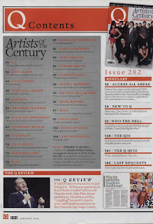
This time, I'm only analysing the cover and contents page of an issue of Q from January 2010.
 Cover - The cover is dominated by the photograph for the cover story, which is about artists of the century. The cover folds out so the graphics is over three A4 pages, showing how many artists are included and so what good value the magazine is. The masthead is also dominant, as it is on a red square, which stands out from the predominantly black and white picture. The banner is confined to the top right hand corner, which tells us about the graphics below. It stands out as it is black on white, meaning that it is dominant. There is a strap line at the top of the page promoting the magazine, and the word 'biggest' is in italics to emphasise that it is a very important magazine. There is a strong brand identity, as the colours red, black and white are used throughout the cover, and the font that is used often has serifs.
 Cover - The cover is dominated by the photograph for the cover story, which is about artists of the century. The cover folds out so the graphics is over three A4 pages, showing how many artists are included and so what good value the magazine is. The masthead is also dominant, as it is on a red square, which stands out from the predominantly black and white picture. The banner is confined to the top right hand corner, which tells us about the graphics below. It stands out as it is black on white, meaning that it is dominant. There is a strap line at the top of the page promoting the magazine, and the word 'biggest' is in italics to emphasise that it is a very important magazine. There is a strong brand identity, as the colours red, black and white are used throughout the cover, and the font that is used often has serifs.
Contents - The dominant part of the contents page is the grey rectangle containing the titles of the pages for the artists of the century, or the cover story. This appears to also take up most of the magazine. On the right hand side is a section called 'the regulars', which contains elements that are in every issue. The last part of the contents is at the bottom, and is called 'the Q review', which is a review of the Q awards stage. The title of the contents page continues the brand identity, as it is white writing on a red rectangle, and the font has serifs. The graphics on the page are in a minority. There is an image of the front cover in the top right hand corner, a picture of a double page spread in the bottom right. and a photograph of Frank Sinatra in the bottom left corner, which relates to the Q awards. The brand identity is throughout the page, as the colours used are grey, white, black and red, and the font is the same.
I like the way that Q has created a clear brand identity that also makes the magazine classy and grown up. It is set out in a clear, geometric way, and the images used are only necessary to the stories. I will use these things to influence my design.
Textual analysis
For my textual analysis, I have chosen to analyse an issue (issue 1293) of kerrang.
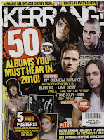
Cover - There is a photo montage of artists that feature in the cover story, so that if someone that interests you is on the front, it will grab your attention. There are other images on the front cover, showing you sneak peeks of the posters inside, which would also entice a buyer. The cover lines are frequent and are names of bands involved in the cover story. The masthead is the most dominant part of the page, and is an onomatopoeia word relating to the sound a guitar makes. The front cover is punchy and grabs the attention of anyone scanning the shelves for something to buy.

Contents - The main article/big story covers half of the contents page, showing it's importance, and as they are a very popular band, brings in even more readers. More pictures that dominate the page, relating to stories in the issue. The contents is put into sections so you can go straight to where you want. There is a story from the editor, making the magazine seem more personal, along with a photograph where the editor is looking at the reader which also makes it more personal. The colour scheme is black, white and yellow, which is striking, and consistent throughout. People often look at contents pages before buying a magazine, and this page captures the intrests of many types of people, depending on what bands would catch your eye.
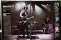
Double page spread - Gig review. The double page spread is made up mostly of a photograph from the gig of the lead singer of Placebo. This is a commonly used technique by Kerrang, whereas other magazines such as NME or Q have more text, at a ratio of about 50:50. The review is in a column to the left hand side, with a 'K' (like stars) review and then longer review underneath. The main heading is purely the name of the band, but underneath subheadings are used to include important information such as warm up bands and the main opinion of the gig. Opinions of fans who was at the gig are included to give a more personal touch to it, and to get the opinions of people that are more like the reader than the kerrang staff. The photographs of the people speaking add to the personal touch. This article would generally only appeal to fans of Placebo, however people that enjoy going to gigs may see the K rating, showing that they're a good band to see live.
I think that the way the kerrang magazine is designed and set up is incredibly efficient. It has a good solid colour scheme that works throughout, and uses a variety of tactics to entice people into buying it. I shall take some of the things kerrang uses and incorporate them into my magazine.

Cover - There is a photo montage of artists that feature in the cover story, so that if someone that interests you is on the front, it will grab your attention. There are other images on the front cover, showing you sneak peeks of the posters inside, which would also entice a buyer. The cover lines are frequent and are names of bands involved in the cover story. The masthead is the most dominant part of the page, and is an onomatopoeia word relating to the sound a guitar makes. The front cover is punchy and grabs the attention of anyone scanning the shelves for something to buy.

Contents - The main article/big story covers half of the contents page, showing it's importance, and as they are a very popular band, brings in even more readers. More pictures that dominate the page, relating to stories in the issue. The contents is put into sections so you can go straight to where you want. There is a story from the editor, making the magazine seem more personal, along with a photograph where the editor is looking at the reader which also makes it more personal. The colour scheme is black, white and yellow, which is striking, and consistent throughout. People often look at contents pages before buying a magazine, and this page captures the intrests of many types of people, depending on what bands would catch your eye.

Double page spread - Gig review. The double page spread is made up mostly of a photograph from the gig of the lead singer of Placebo. This is a commonly used technique by Kerrang, whereas other magazines such as NME or Q have more text, at a ratio of about 50:50. The review is in a column to the left hand side, with a 'K' (like stars) review and then longer review underneath. The main heading is purely the name of the band, but underneath subheadings are used to include important information such as warm up bands and the main opinion of the gig. Opinions of fans who was at the gig are included to give a more personal touch to it, and to get the opinions of people that are more like the reader than the kerrang staff. The photographs of the people speaking add to the personal touch. This article would generally only appeal to fans of Placebo, however people that enjoy going to gigs may see the K rating, showing that they're a good band to see live.
I think that the way the kerrang magazine is designed and set up is incredibly efficient. It has a good solid colour scheme that works throughout, and uses a variety of tactics to entice people into buying it. I shall take some of the things kerrang uses and incorporate them into my magazine.
Comparing music magazines
I took a range of music magazines and compared them to see what I should include.
Big Cheese:
- Price: £3.90
- 102 pages
- 26 sections
- Adverts include Vans! and denimwear.
- Typical articles include the cover story (paramore), what artists listen to, legends (old bands), musicians corner.
Mix Mag:
- Price: £4.20
- 122 pages
- 21 sections, roughly 6 pages per section
- Adverts include Godskitchen and Above & beyond concert
- Typical articles include fashion/tunes, VIP, regulars and tech
Q:
- Price: £3.90
- 162 pages
- 8 sections, at most 42 pages long.
- Adverts include Hard-fi, empire magazine, vinyls
- Typical articles include reviews, gadgets, songwriters portfolio and Q mail
Vibe:
- Price: £3.95
- 120 pages
- 13 sections, at most 6 pages long
- Adverts include Mastercard, Heineken and Beyonce
- Typical articles include fashion, cars, Solja Boy and Usher
From this we can seee that different magazines offer different things, and some are more worth your money than others. I want my magazine to have plenty of pages and not be overly expensive. I will also use a cover story, and sections about artists themselves, which seem to be common.
NEW action plan :)
So, here is my list of things to do:
03.01.11 - Textual analysis
10.01.11 - Audience questionaire/ anaylsis, poll, colour & font analysis.
17.01.11 - Internet research, institiutions, treatment sheet
24.01.11 - Layout design
31.01.11 - Photoshoot, photo editing.
07.02.11 - Drafting cover
14.02.11 - Final touches
28.02.11 - Audience feedback
07.03.11 - Evaluation
Here we go!
Subscribe to:
Comments (Atom)


