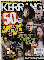
Cover - There is a photo montage of artists that feature in the cover story, so that if someone that interests you is on the front, it will grab your attention. There are other images on the front cover, showing you sneak peeks of the posters inside, which would also entice a buyer. The cover lines are frequent and are names of bands involved in the cover story. The masthead is the most dominant part of the page, and is an onomatopoeia word relating to the sound a guitar makes. The front cover is punchy and grabs the attention of anyone scanning the shelves for something to buy.

Contents - The main article/big story covers half of the contents page, showing it's importance, and as they are a very popular band, brings in even more readers. More pictures that dominate the page, relating to stories in the issue. The contents is put into sections so you can go straight to where you want. There is a story from the editor, making the magazine seem more personal, along with a photograph where the editor is looking at the reader which also makes it more personal. The colour scheme is black, white and yellow, which is striking, and consistent throughout. People often look at contents pages before buying a magazine, and this page captures the intrests of many types of people, depending on what bands would catch your eye.

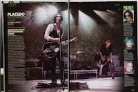
Double page spread - Gig review. The double page spread is made up mostly of a photograph from the gig of the lead singer of Placebo. This is a commonly used technique by Kerrang, whereas other magazines such as NME or Q have more text, at a ratio of about 50:50. The review is in a column to the left hand side, with a 'K' (like stars) review and then longer review underneath. The main heading is purely the name of the band, but underneath subheadings are used to include important information such as warm up bands and the main opinion of the gig. Opinions of fans who was at the gig are included to give a more personal touch to it, and to get the opinions of people that are more like the reader than the kerrang staff. The photographs of the people speaking add to the personal touch. This article would generally only appeal to fans of Placebo, however people that enjoy going to gigs may see the K rating, showing that they're a good band to see live.
I think that the way the kerrang magazine is designed and set up is incredibly efficient. It has a good solid colour scheme that works throughout, and uses a variety of tactics to entice people into buying it. I shall take some of the things kerrang uses and incorporate them into my magazine.
No comments:
Post a Comment