 Cover - The cover is dominated by the photograph for the cover story, which is about artists of the century. The cover folds out so the graphics is over three A4 pages, showing how many artists are included and so what good value the magazine is. The masthead is also dominant, as it is on a red square, which stands out from the predominantly black and white picture. The banner is confined to the top right hand corner, which tells us about the graphics below. It stands out as it is black on white, meaning that it is dominant. There is a strap line at the top of the page promoting the magazine, and the word 'biggest' is in italics to emphasise that it is a very important magazine. There is a strong brand identity, as the colours red, black and white are used throughout the cover, and the font that is used often has serifs.
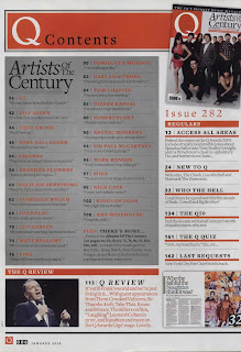
Contents - The dominant part of the contents page is the grey rectangle containing the titles of the pages for the artists of the century, or the cover story. This appears to also take up most of the magazine. On the right hand side is a section called 'the regulars', which contains elements that are in every issue. The last part of the contents is at the bottom, and is called 'the Q review', which is a review of the Q awards stage. The title of the contents page continues the brand identity, as it is white writing on a red rectangle, and the font has serifs. The graphics on the page are in a minority. There is an image of the front cover in the top right hand corner, a picture of a double page spread in the bottom right. and a photograph of Frank Sinatra in the bottom left corner, which relates to the Q awards. The brand identity is throughout the page, as the colours used are grey, white, black and red, and the font is the same.
I like the way that Q has created a clear brand identity that also makes the magazine classy and grown up. It is set out in a clear, geometric way, and the images used are only necessary to the stories. I will use these things to influence my design.
No comments:
Post a Comment